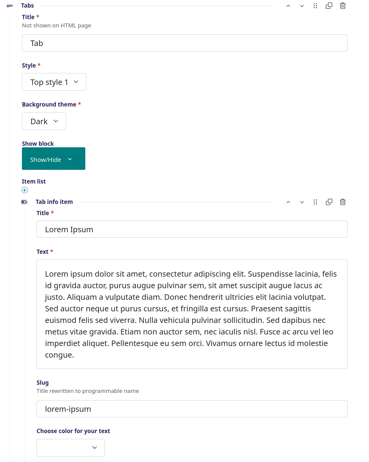
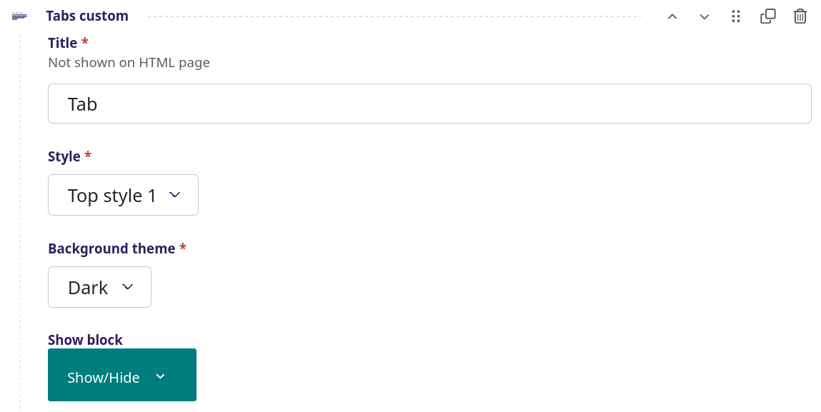
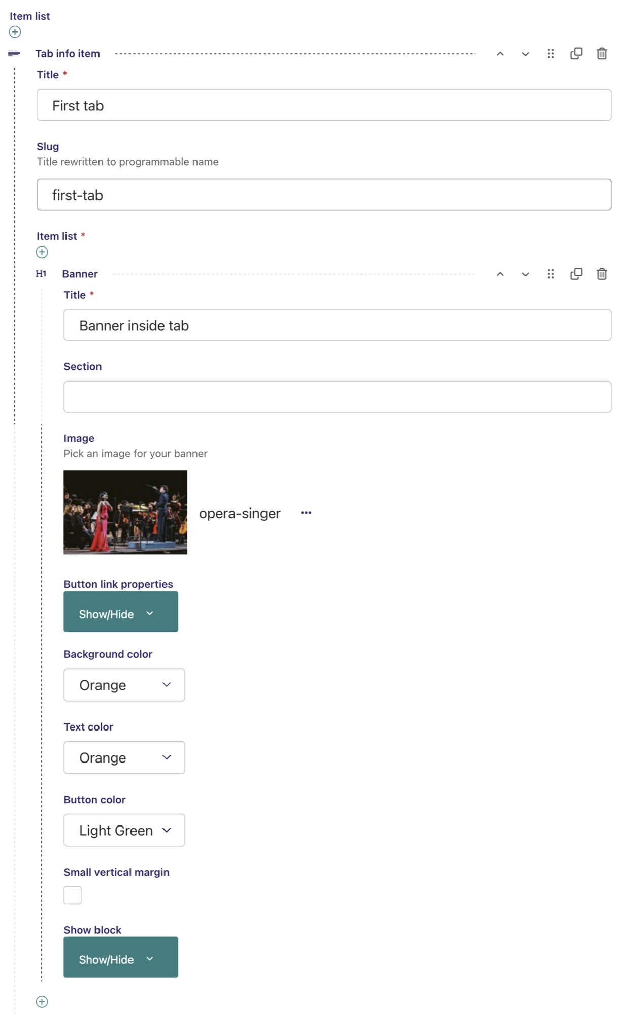
Streamblocks category Tabs blocks

Accordion

Accordion

Lorem ipsum dolor sit amet, consectetur adipiscing elit, sed do eiusmod tempor incididunt ut labore et dolore magna aliqua. Ut enim ad minim veniam, quis nostrud exercitation ullamco laboris nisi ut aliquip ex ea commodo consequat. Duis aute irure dolor in reprehenderit in voluptate velit esse cillum dolore eu fugiat nulla pariatur. Excepteur sint occaecat cupidatat non proident, sunt in culpa qui officia deserunt mollit anim id est laborum.

Pellentesque augue est, maximus non mauris bibendum, ornare tincidunt tellus. Curabitur ultrices nisl eget tortor auctor, fermentum malesuada est bibendum. Nunc in massa quis magna sodales bibendum. Nullam ornare a purus posuere lobortis. Vestibulum mollis feugiat enim, eget faucibus nunc elementum pellentesque. Aenean convallis, lacus nec euismod pellentesque, massa libero vulputate odio, tempus convallis tortor leo quis enim. Nullam vitae enim in lorem ullamcorper faucibus. Suspendisse aliquam, enim nec hendrerit suscipit, dui sem feugiat justo, pellentesque iaculis nisi augue et dui. Nunc rutrum scelerisque arcu vel laoreet

Duis dui ex, tristique a lobortis id, accumsan eget nunc. Donec blandit dui vitae faucibus commodo. Proin feugiat gravida tristique. Donec ante neque, ullamcorper at placerat ac, ornare id magna. Maecenas fringilla quis enim eu rutrum. Nullam a ligula eget ligula rhoncus varius. Etiam id dolor pulvinar, sollicitudin eros nec, iaculis nisl. Vivamus interdum tellus ultrices auctor vulputate.

Accordion - screenshot

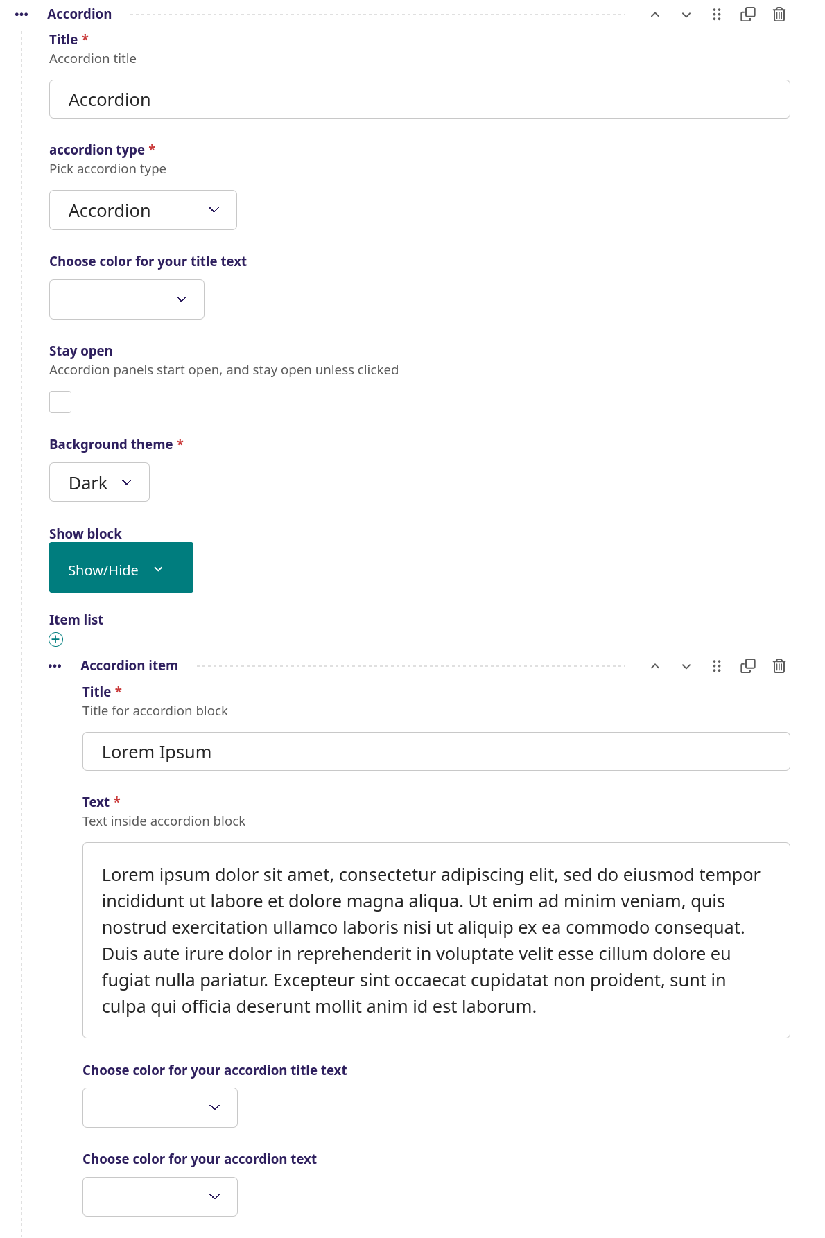
Here the tabs are arranged in an accordian format, with each block below each other. Each block of the accordian can have a title and a text.


Setup

Title - The title of the accordion, in this example 'Accordion'

Accordion type - Choose between 'accordion' and 'flush accordion'

Title color - Choose between 9 colors for the title

Stay open - If selected, the accordion will be open from start and stay open unless it is manually closed be the user

Background theme - Choose between a dark or light background

Show block - When to show the title (see more info here)

Item list - Here the accordion items are inserted, in this example three accordion blocks are added after one another

Title - The title of the accordion block, in this example 'Lorem Ipsum'
Text - The text inside the accordion block

Title color - Choose between 9 colors for the title

Color for your accordion text - Choose between 9 colors for the text

Same procedure with the following two accordion blocks

Tabs

Tabs - screenshot

A classical tabs format, where the graphical user interface object allows multiple panels to be contained within a single window next to each other.


Setup

Title - The title of the tab, this is not visible on the page

Style - Choose between 'Top style 1', 'Top style 2', 'Left' and 'Right'

Background theme - Choose between a dark or light background

Show block - When to show the title (see more info here)

Item list - Here the tab items are inserted, in this example three tabs

Title - The title of the tab, in this example 'Lorem Ipsum'
Text - The text inside the tab block

Slug - Title with small letters for programmable name

Choose color for your text - Choose between 9 colors for the text

Same procedure with the following two tab blocks

Tabs custom

Tabs custom - screenshot

A more advanced type of the classical tabs format, where it is possible to have banner images with title text and link overlay and a text section below the image.


Setup

Title - The title of the tab, this is not visible on the page

Style - Choose between 'Top style 1', 'Top style 2', 'Left' and 'Right'

Background theme - Choose between a dark or light background

Show block - When to show the title (see more info here)


Tab info item - Here the tab items are inserted, in this example one tab

Title - The title of the tab, in this example 'First tab'

Slug - Title with small letters for programmable name

Item list - Here the items are inserted, in this example one banner
Banner - (the item)
Title
- The title of the banner, in this example 'Banner inside tab'

Section - Bookmark on page for short cut in side menu

Image - It is posssible to use an image for the banner, in this example an opera image

Button text - Here a text link can be added, either to an internal page or to an external linkURL, in this example there is an external link to Google that opens up in a new window when clicked

Choose color for background - Choose between 9 colors for the background, in this case the background is the opera image

Choose color for your text - Choose between 9 colors for the text

Choose color for the button - Choose between 9 colors, in this case light green

Small vertical margin - Minimize top and bottom margins and use less space on the page

New block is inserted, here a simple text block

Title - The title of the text, in this example 'Title inside tab'

Sub title - The sub title of the text, in this example 'This is just a title block'

Section - Bookmark on page for short cut in side menu

Separator line – A separator line below the sub title, in this example a blue line

Style - Choose between Small title and large subtitle' or as in this example 'Large title and small sub title.

Text alignment - Sets the text in the middle, on the left or on the right side

Title color - Color for the title, in this example blue

Tub title color - Color for the title, in this example blue

Banner color - Color for the banner, in this example blue

Background theme - Choose between a dark or light background
Show block - When to show the title (see more info here)

Steps

  • Step one
  • Step two
  • Step three

Sift the flour, baking powder, and salt into a bowl, then whisk together and set aside. Sifting the dry ingredients helps prevent lumps that would weigh down the batter.

Cream the butter and then add the sugar. The mixture should look pale yellow and fluffy when done.

Add the vanilla, then eggs one at a time. Scrape the bowl down in between so everything is evenly mixed.

Steps - screenshot

A special type of tabs in a circle format, when the circles are clicked users can switch between different text sections below the circles.


Setup


Title
- The title of the download file, this does not show up on the page

Background theme - Choose between a dark or light background
Show block - When to show the title (see more info here)


Item list - This is where items are inserted
Tab info item - The first inserted tap info item
Title - The title of the tap info item, in this example 'Step 1'
Text - The text of this tap info item, in this example 'Sift the flour, baking powder, and salt into ...'
Choose color for your title text - choose between 9 different colors

Same procedure with the following two tab info items

Download PDF