Streamblocks category Other blocks
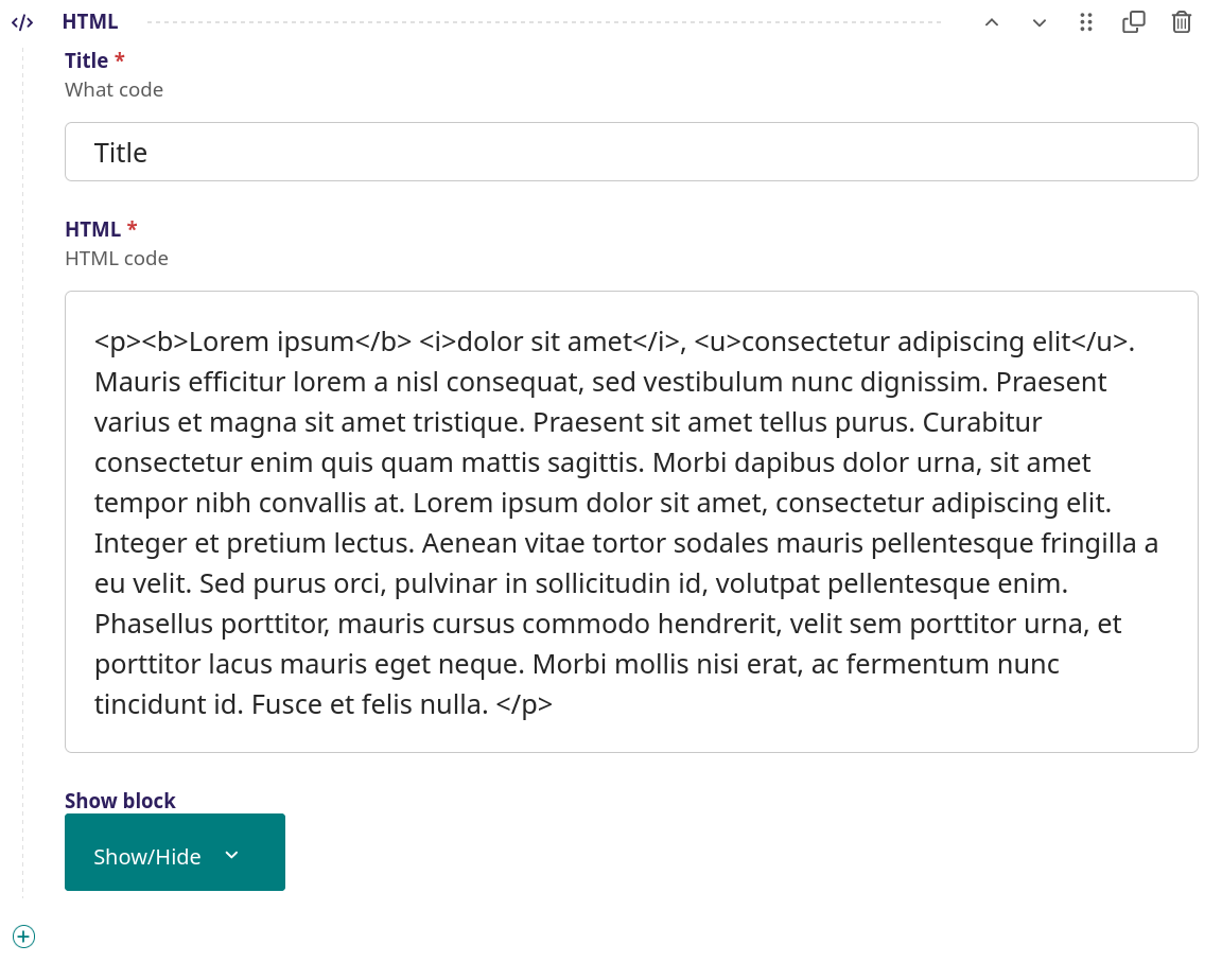
Raw HTML block
Lorem ipsum dolor sit amet, consectetur adipiscing elit. Mauris efficitur lorem a nisl consequat, sed vestibulum nunc dignissim. Praesent varius et magna sit amet tristique. Praesent sit amet tellus purus. Curabitur consectetur enim quis quam mattis sagittis. Morbi dapibus dolor urna, sit amet tempor nibh convallis at. Lorem ipsum dolor sit amet, consectetur adipiscing elit. Integer et pretium lectus. Aenean vitae tortor sodales mauris pellentesque fringilla a eu velit. Sed purus orci, pulvinar in sollicitudin id, volutpat pellentesque enim. Phasellus porttitor, mauris cursus commodo hendrerit, velit sem porttitor urna, et porttitor lacus mauris eget neque. Morbi mollis nisi erat, ac fermentum nunc tincidunt id. Fusce et felis nulla.
Raw HTML block - screenshot
This block consists of pure text that can be html-formatted, e.g. text parts that are underlined or in bold
Setup
Title - The title of the HTML block, this does not show up on the page
HTML - Here the HTML formatted text is inserted
Show block - When to show the title (see more info here)
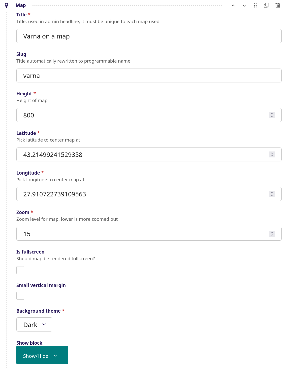
Map block
Map block - screenshot
Integration of Google maps on a page with a specific latitude and longitude inclusive of a popup item for a specific location
Setup
Title - The title of the map, thi is not visible on the page but each map used must have a unique title
Slug - Use lower case of title
Height - The height of the map in pixel
Latitude - Use a Google Map latitude to center the map
Longitude - Use a Google Map longitude to center the map
Zoom - The zoom level for the map, lower number gives a more zoomed out result
Is fullscreen - When selected, the map will show is fullscreen format
Small vertical margin - Minimize top and bottom margins and use less space on the page
Background theme - Choose between a dark or light background
Show block - When to show the title (see more info here)
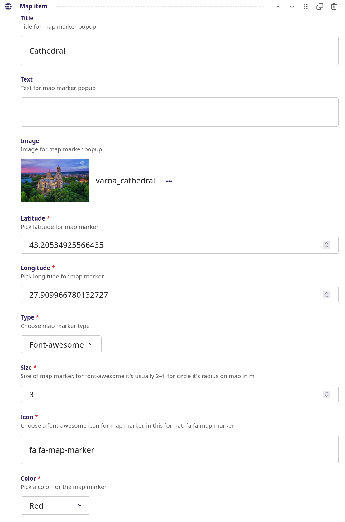
Setup of Map item
Title - The title for the popup item, in this example the Cathedral
Text - Text about the the popup item
Image - The image of the popup item
Latitude - Use a Google Map latitude for the popup item
Longitude - Use a Google Map longitude for the popup item
Type - This refers to the marker on the map, choose between circle and font-awesome. See the 'font awesome 5' icon library, reference guide for icons is available at font awesome 5 icons.
Size - The size of the marker
Icon - The 'font awesome 5' icon used here is 'map-marker'
Color - The color of the map marker (e.g. the circle)
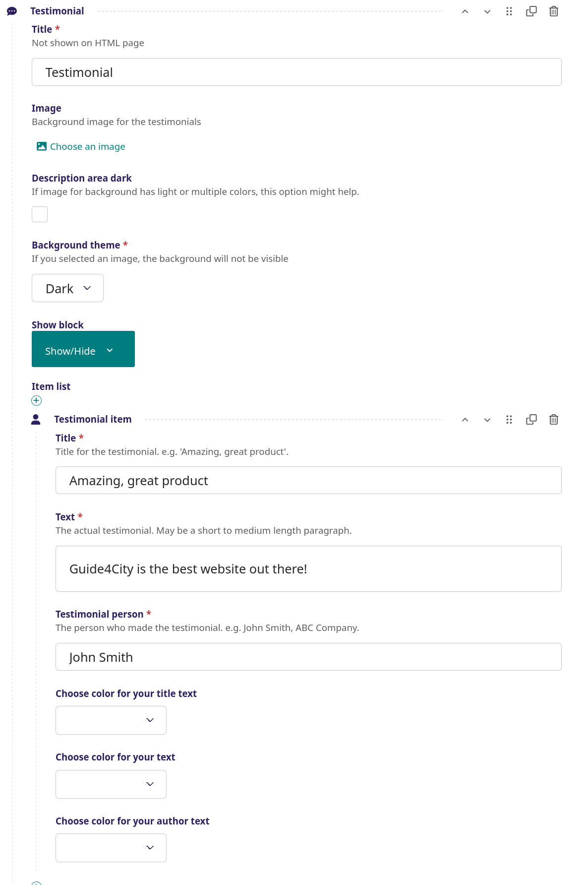
Testimonial
Amazing, great productGuide4City is the best website out there!
John Smith
Testimonial screenshot
Integration of testimonials for a page inclusive name and testimonial text, text can be on top of an image or with a background color
Setup
Title - The title of the testimonial, this does not show up on the page
Background image - It is possible to insert af background image, in the above example, there is no image
Description area dark - Can be used if a background image is light or have many colors
Image - Background image, which will be stretched over the banner
Color for background - If image not used, color for the banner background
Color for text - Should be opposite of background image or color to be visible
Small vertical margin - Minimize top and bottom margins and use less space on the page
Show block - When to show the title (see more info here)
Item list - The testimonial item/s to be used
Title - The title of the testimonial
Text - The text of the testimonial is inserted here
Testimonial person - The reference to a person
Choose color for your title text - Choose between 9 text colors
Chose color for your text - Choose between 9 text colors
Chose color for your author text - Choose between 9 text colors
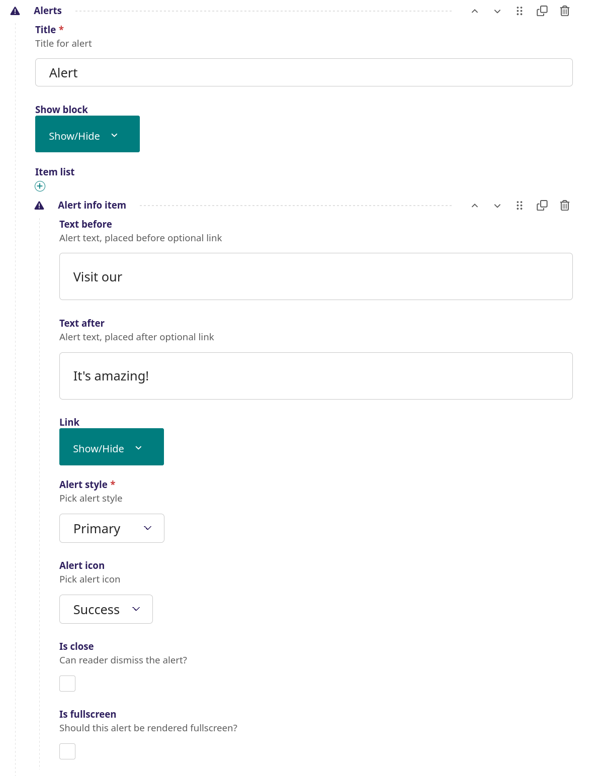
Alerts
Alerts - screenshot
A page that has one or more alerts, an alert can have an internal or external link that leads to another page when clicked. An alert can be defined in such a way that a user can dismiss it (close the alert window). There are different possible alert types, e.g. danger, warning, info.
Setup
Title - The title of the alert, this does not show up on the page
Show block - When to show the title (see more info here)
Item list - The alert/s to be used
Text before - Text placed before (optional) alert link
Text after - Text placed after (optional) alert link
Link - Link properties - where a link can be defined, in this example 'Gallery' is the link leading to the internal to the external page varna.guide4city.com/varna-gallery. This link can also be an internal page
Alert style - Choose bewteen 8 alert types, e.g. danger, warning, info, light, dark.
Alert icon - Choose bewteen 3 icons and no icon
Is close - When selected the user can dismiss the alert, i.e. close the alert window
Is fullscreen - When selected the alert is rendered fullscreen
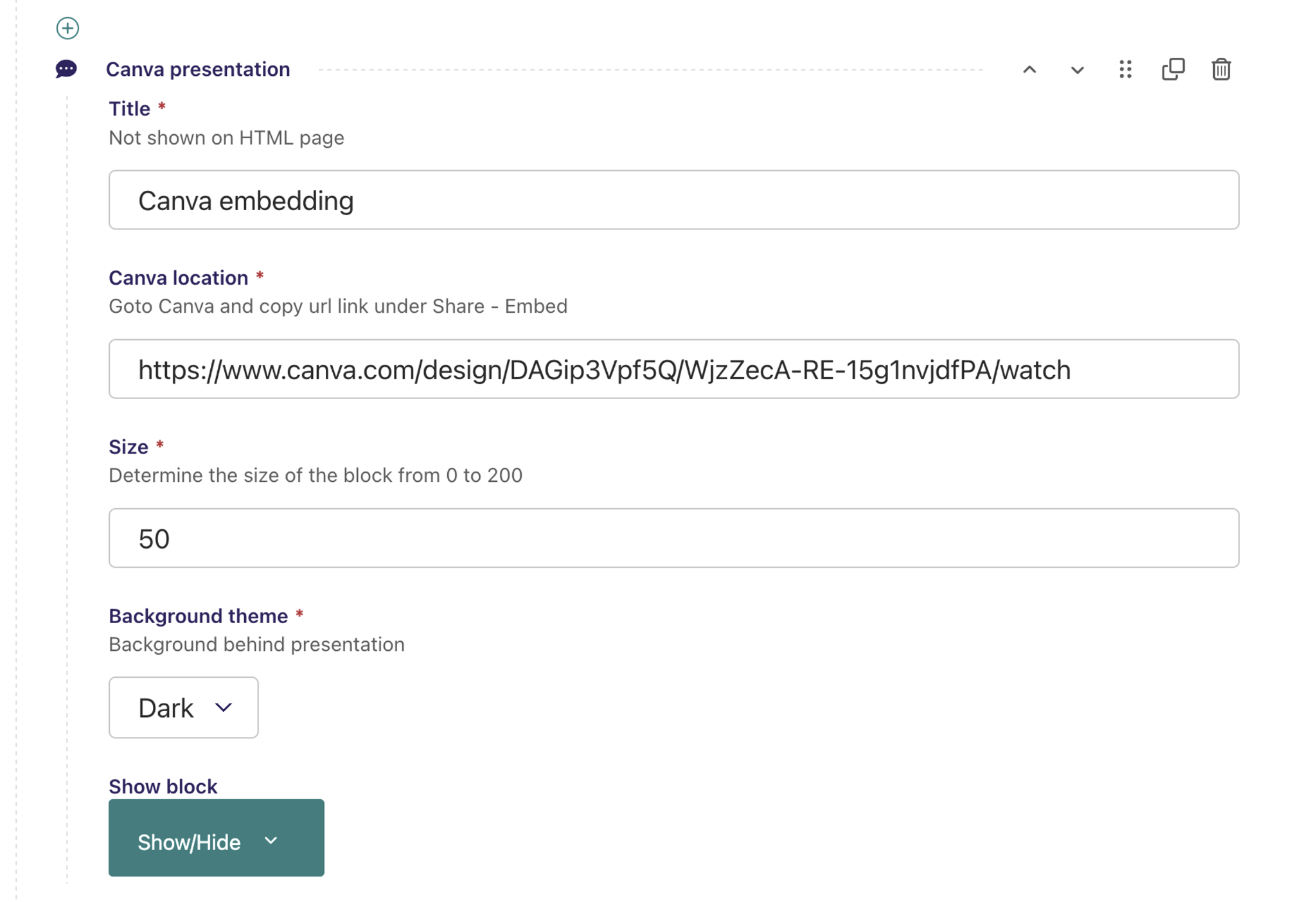
Canva embed

Canva - screenshot
Content from Canva (e.g. graphics, video, spreadsheet) can be integrated in this block type
Setup
Title - The title of this Canva block, this does not show up on the page
Canva location - Here the Canva code is inserted, go to Canva and copy the url link under 'Share - Embed'
Background theme - Choose between a dark or light background
Show block - When to show the title (see more info here)