Streamblocks category Gallery blocks
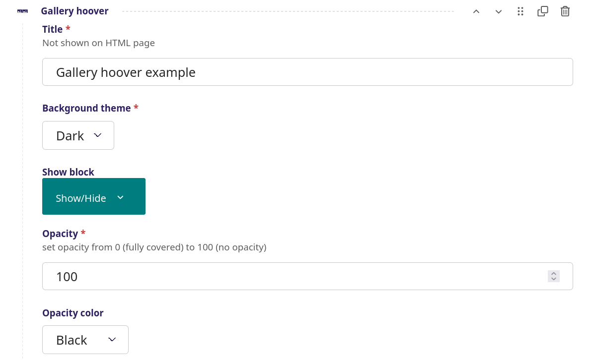
Gallery hoover

Volleyball game
First item

Picking mushrooms
Second items

Classic concert
Third items
Gallery hoover screenshot
A simple image gallery with a mouse over effect that brings up a title and text on top of the image
setup
Title - The title of this Gallery hoover, this does not show up on the page
Background theme - Choose between a dark or light background
Show block - When to show the title (see more info here)
Opacity- Set opacity of the text block that appears on top of the image when the mouse
is over, from 0 (fully covered) to 100 (no opacity), in this example 100 is used
Opacity color - Choose between 6 colors or none, in this example black is used
Item list for this Gallery hoover
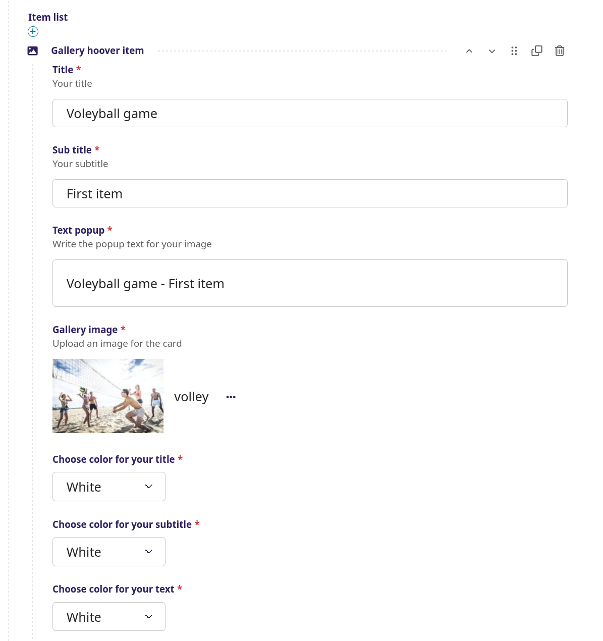
Gallery hoover item (first item in this Gallery hoover)
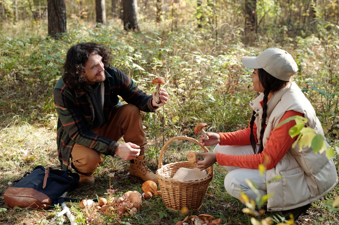
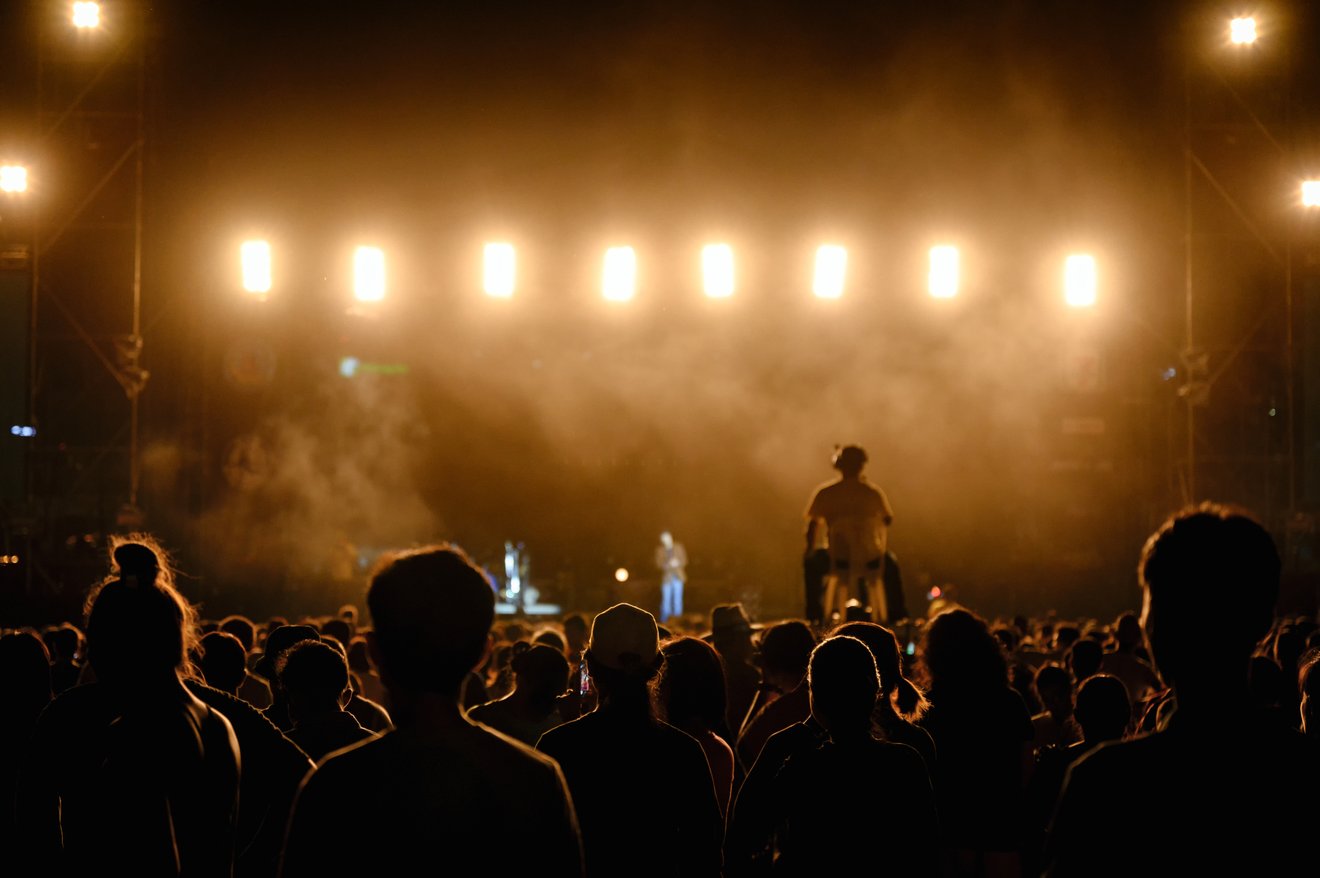
Title - The title of this Gallery hoover item, in this example 'Volleyball game'
Sub title - The sub title of this Gallery hoover item, in this example 'First item'
Text popup - Insert the main text here for the popup when mouse goes over the image, in this example 'Volleyball game - First item'
Gallery image - The image for the first item in this Gallery hoover
Chose color for your title - Choose between 9 colors for the title
Chose color for your sub title - Choose between 9 colors for the sub title
Chose color for your text - Choose between 9 colors for the text
In this example the next Gallery hover item is inserted in the same manner, 'Picking mushrooms' as the second item in this Gallery hoover and 'Classic concert' as the third item in this Gallery hoover
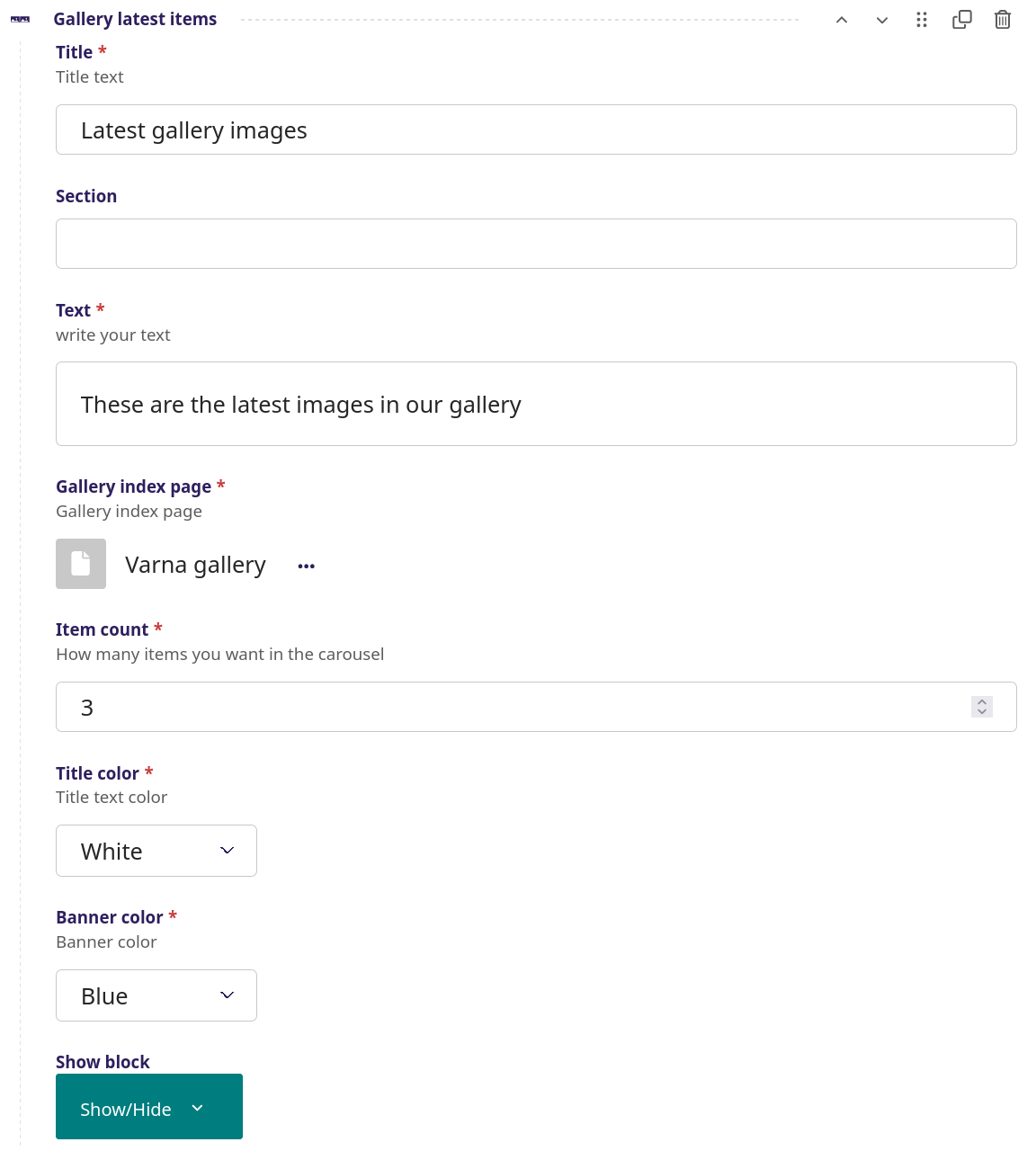
Gallery latest items


Gallery latest items - screenshot
A series of images in a slider carousel each with a title in the center of image. The images can be dragged forward or backward to the side by a mouse click or through navigation arrows. Each image can be made clickable with a link to the image in full size.
setup
Title - The title of this gallery, in this example 'Latest gallery images'
Section - Bookmark on page for short cut in side menu
Text - The text under the title, in this example 'These are the latest images in our gallery'
Gallery index page - Link to the Gallery index page that is to be used
Item count - The amount of images from the gallery that will be show
Title color - Color for title, , in this example 'white'
Banner color - Color for the banner, in this example 'blue'
Show block - When to show the title (see more info here)
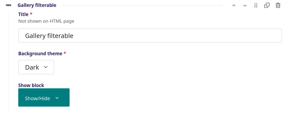
Gallery filterable


Gallery filterable - screenshots
An advanced image gallery feature, where several rows of images can be defined each with a corresponding gallery tab. Each image can have a text title that can be made clickable with a link to the image in full size.
setup
Title - The title of this gallery, does not show up on the page
Background theme -
Show block - When to show the title (see more info here)
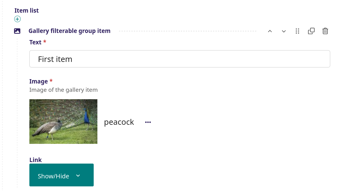
Item list
Gallery filterable group - The overall group for gallery filterable
Title - The heading for the gallery categories, in this example 'First group'. The first is recommended to be 'All'.
Slug - Title rewritten to programmable name
Show block - When to show the title (see more info here)
Item list
Gallery filterable group item - The first item in this Gallery filterable group
Text - The text superimposed on top of the image on mouse over. in this example 'First item'
Image - Image used as the first item, this is selected in the image galley
Link - Where a link can be defined. This feature is not used in this example
After this the same procedure, where the the next three Gallery filterable group items are added below. This is followed by another Item list Gallery filterable group, in this example called 'Second group'. In this Gallery filterable group, 4 Gallery filterable group items are added (each with an Image and a Text.