
Streamblocks category Banner blocks
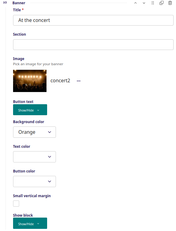
Standard banner
At the concert
Standard banner - setup
Full with banner with either color or image background to separate contents of a web page.
Setup
Title - Large text inside the banner
Section - Bookmark on page for short cut in side menu
Image - Background image, which will be stretched over the banner
Color for background - If image not used, color for the banner background
Color for text - Should be opposite of background image or color to be visible
Small vertical margin - Minimize top and bottom margins and use less space on the page
Show block - When to show the title (see more info here)
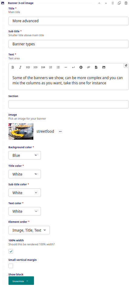
Banner 3 column image
More advanced
Banner types
Some of the banners we show, can be more complex and you can mix the columns as you want, take this one for instance
Banner 3 column image - setup
Banner consisting of 3 blocks: Image, title and text.
You can decide the order of these blocks and the colors inside them.
Setup
Title - First line of the title block
Sub title - Second line of the title block
Text - HTML formatted text
Section - Bookmark on page for short cut in side menu
Image - Image for banner background, overrides background color
Background color - Color for banner if there is no image inserted
Title color - Color for title
Sub title color - Color for sub title
Text color - Color for text
Element order - In which order should columns appear
100% width - If checked, banner follows screen width, if not banner follows left and right margins
Small vertical margin - Minimize top and bottom margins and use less space on the page
Show block - When to show the title (see more info here)
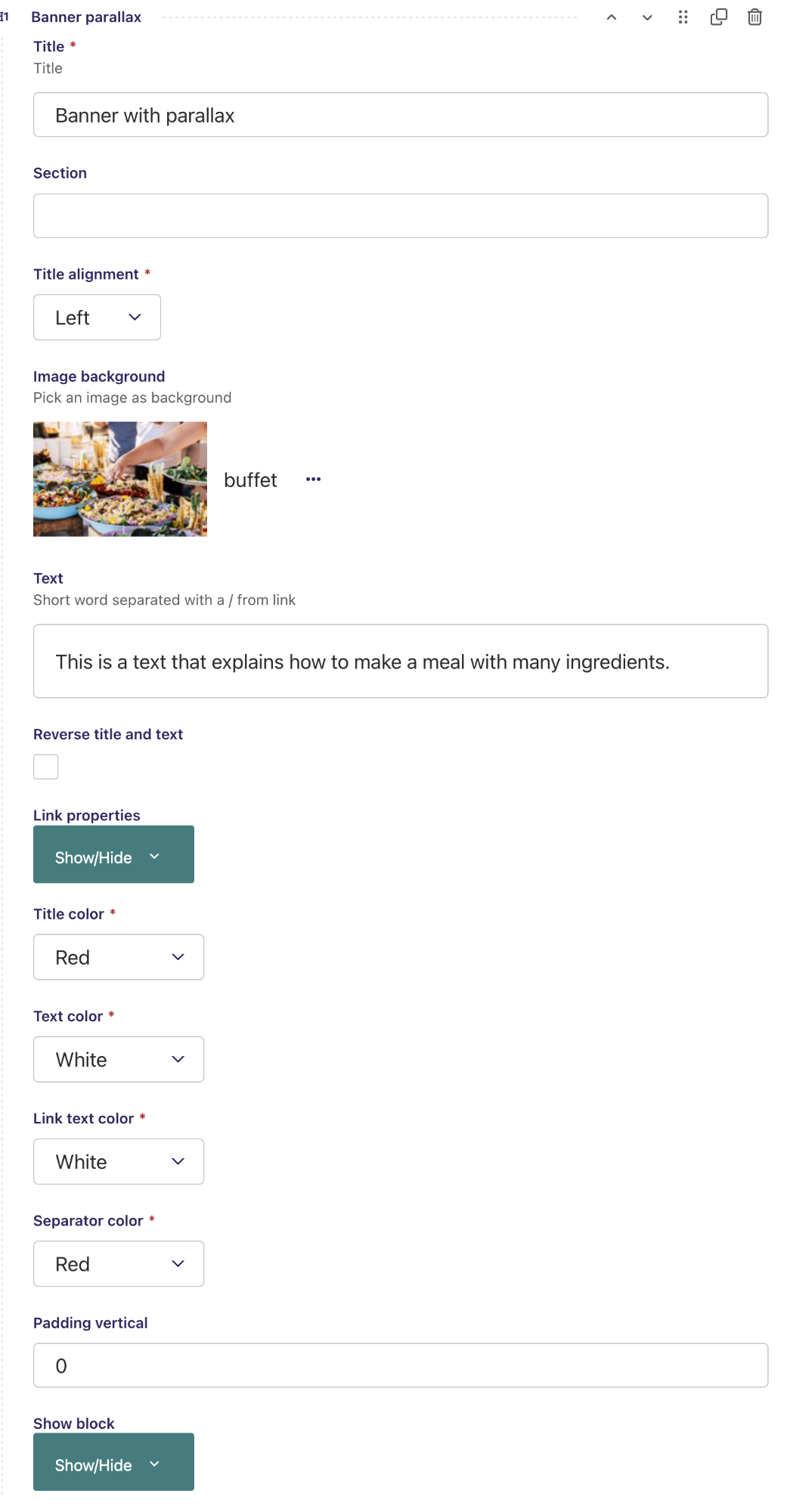
Banner with parallax
Banner with parallax
This is a text that explains how to make a meal with many ingredients.
Banner with parallax - setup
Banner with image where text flows over the image.
Setup
Title - First line of the title block
Section - Bookmark on page for short cut in side menu
Title alignment - Sets the title in the middle, on the left or on the right side
Image background - Image used as banner background, overrides the orange default banner background color
Text short: short word separated with a / from link - In this example 'Read more' is a clickable link, the separator (backslash) separates the link from the text that follows
Reverse title and text - When box is activated, the title and text swap sides
Link properties - Where a link can be defined, in this example 'Read more' is the link leading to the internal page 'How to become a business partner'. This link can also be an external webpage
Title color - Color for title
Text color - Color for the text following after link and backslash
Link text color - Color for the link text, in this example 'Read more'
Separator color - Color for / (backslash) in this example set to red
Padding vertical - A number that defines the height of the image
Show block - When to show the title (see more info here)
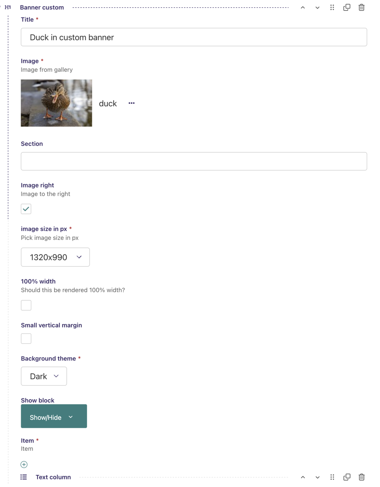
Banner custom
Here you put an image to either the left or the right side, and you can basically insert anything else on the other side... and it still works with smartphones....
Here the left side next to the image has a 'Text column' option inserted but it could alternatively have been another type of content. e.g. a Video or Icon column.
In this example the specifications for the 'Text column' are: text color is white, border color is red, the border thickness is 4 and the background is dark grey. But it could also have been white text on black backgrond with no border color.
Banner Custom - screenshot
Banner with image at either right side or left side combined with some other content on the opposite side.
Setup
Title - This title is not shown on the banner
Image - Image used in either the left or right side of the banner
Section - Bookmark on page for short cut in side menu
Image right - When box is activated, the image will be on the right. If not, the image will be on the left side.
Image size in pixels - Choose between 8 different image sizes
100% width - Decide if an image placed on the right side should be rendered with 100% width to the right side and vice versa for an image placed on the left side.
Small vertical margin - When box is activated, the space between the bottom of title box and the top of the image is very limited, this also applies for the space between the bottom of the image and the following element, e.g. beginning of another banner
Background theme - Choose between a dark or light background
Item - On the opposite side of the picture other content can be inserted, e.g. text as in this example. But it can also be other types of content, e.g. an image or a video
Show block - When to show the title (see more info here)
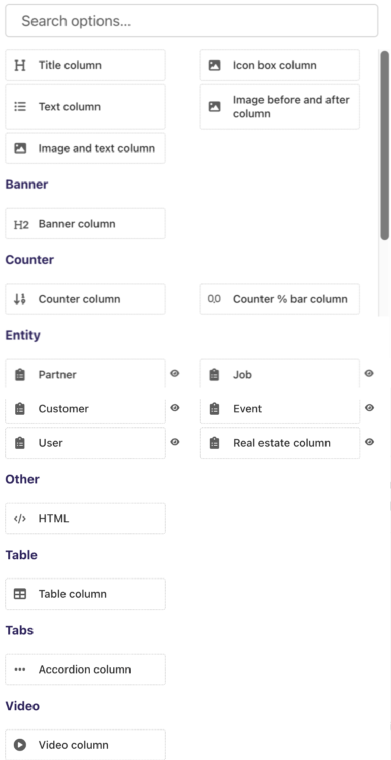
Banner Custom - screenshot - Search options
Search options shows the various possibilities that can be inserted next to the image in a 'Banner custom'. The example chosen above is a text column but it could alternatively be e.g. a video, an icon box column, a table column, etc.
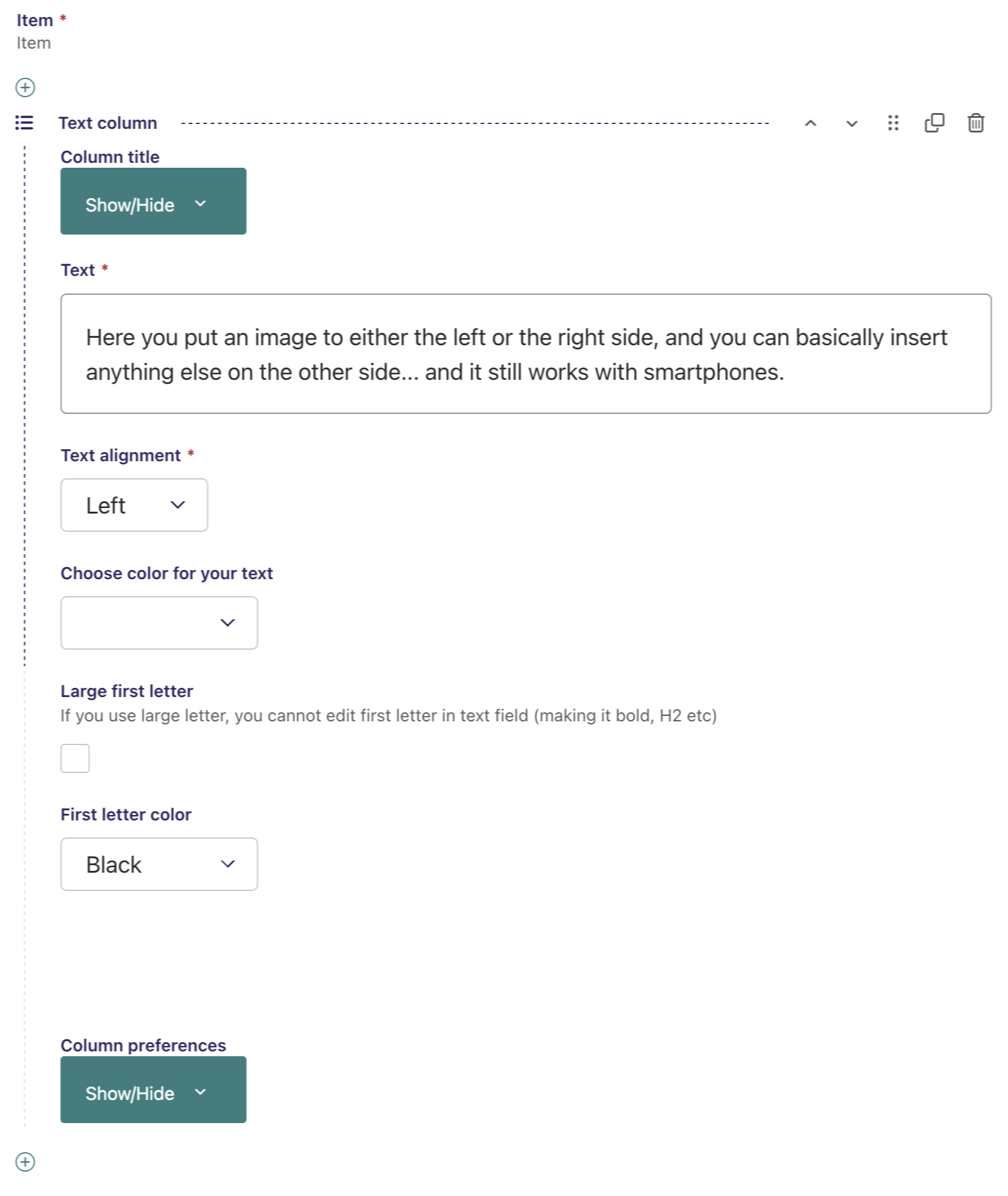
Banner Custom - screenshot - Item example
This screenshot shows the item part of the 'Custom banner' from the above example. It is 'Text column' option that is used, but it could alternatively have been another type of content. e.g. a Video or Icon column.
Column title - Here a title for the 'Text column' can be defined, this title can be shown or hidden. Background as well as title color can be defined.
Text - HTML formatted text is inserted here. In the example above, the text used is "Here you put an image to either the left or the right side, and you can..."
Text alignment - The text alignment can be either Left, Right, Center or Justify
Choose color for your text - choose between 10 different colors
Large first letter - If this option is activated, the first letter will be large but it cannot be edited in the text field (e.g. as bold bold or H2)
First letter color - If the 'Large first letter' option above is selected, the color of the first letter can be defined here
Column preferences - Here it is possible to choose between 4 different sizes of the column to define how big the column should be. Also the border thickness can be defined in pixels, if set to 0, there will be no border. Border and background color can be defined, in the above example the border color is red, the border thickness is 4 and the background is dark grey
Banner 3 columns counter
Another advanced with 3 columns
This time with a counter
Again, this can be sorted with counter, title, text or title, text, counter or any other combination of the three. We will place the counter in the middle this time.
Banner 3 col counter - screenshot
Banner with a counter in 3 columns, this can be sorted with counter, title, text or title, text, counter or any other combination of the three. In the example the counter is placed in the middle, the title to the left and the text to the right.
Setup
Title - The title with large letters
Sub title - Sub title with smaller letters below the main title
Text area - the main text, in this example placed on the right side of the counter
Section - Bookmark on page for short cut in side menu
Count - Set a number, in this example we are counting up to 252
Count text - Text below the counter, in this example 'Visits per month'
Count speed - the count speed effect in milli-seconds - in this example 2000 ms
Background color - Choose between 9 types of background colors, in this example Dark Grey
Counter color - Choose between 9 types of colors for the counter, in this example white
Title below count color - Choose between 9 types of colors for the text below the counter, in this example white
Title color - Choose between 9 types of colors for the counter, in this example white
Sub title color - Choose between 9 types of colors for the counter, in this example white
Text color - Choose between 9 types of colors for the counter, in this example white
Element order - Choose between any sorting order of 'Counter', 'Title', 'Text', in this example 'Title' is to the right, 'Counter' is in the middle and 'Text' is to the right.
Small vertical margin - Minimize top and bottom margins and use less space on the page
100% width - When this option is selected the banner has 100% width
Show block - When to show the title (see more info here)

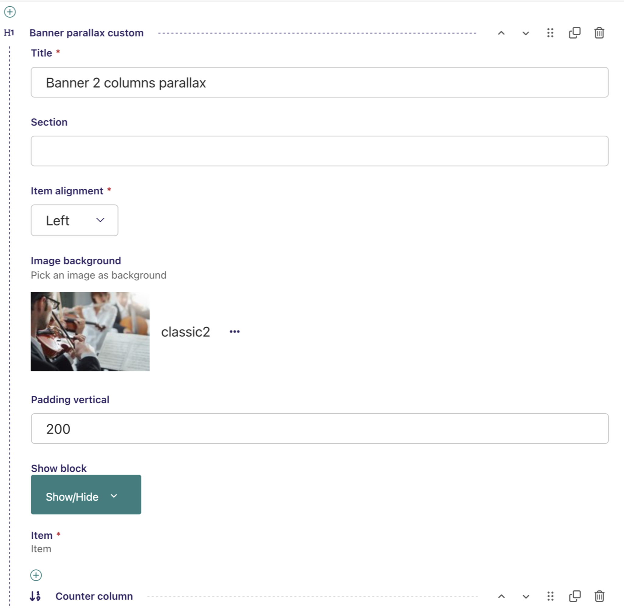
Banner 2 columns parallax
52
UsersBanner 2 columns parallax overview - screenshot
Full overview of 'Banner 2 columns parallex', there are two parts:
1: The main part H1 'Banner parallex customs'
2: The selected 'Item' inserted inside the 'Banner 2 columns parallax', in this example a 'Counter column' is selected.
The setup will be explained below:
a) Setup of the main part H1 'Banner parallex customs'.
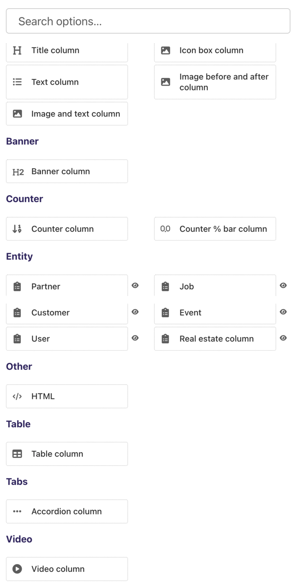
b) Search options showing the various possibilities that can be inserted inside the 'Banner 2 columns parallax'.
c) Setup of the selected 'Item', in this example a 'Counter column'.
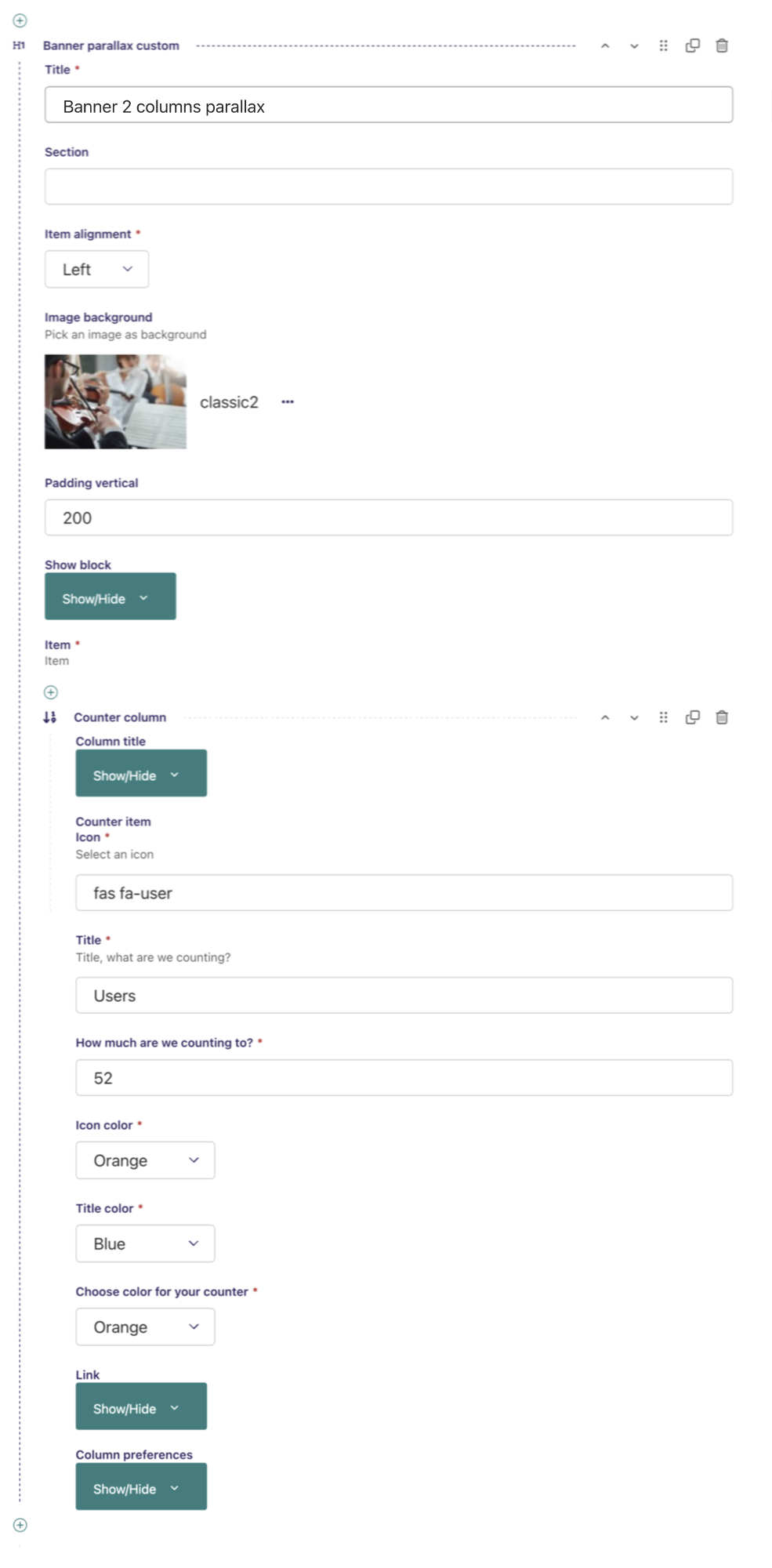
Banner 2 columns parallax main part - screenshot
Banner with 2 columns parallax,
Setup
Title - The title of the banner, this is not shown on the Banner
Section - Bookmark on page for short cut in side menu
item alignment - Choose between 'Left', 'Right' and 'Center'
Image bakground - Choose an image that will be the background
Padding vertical - A number that defines the height of the image
Item - The various options that can be inserted inside the 'Banner parallex customs', in this example a 'Counter column' is the choice. See next screenshot for all the possible options that can be inserted.
Banner 2 columns parallax - screenshot - Search options
Search options shows the various possibilities that can be inserted on the image in a 'Banner 2 columns parallax'. The example chosen above is a 'Counter column' but it could alternatively be e.g. a video, an icon box column, a table column, etc.
Banner 2 columns parallax 'Item' part with a 'Counter column' as example- screenshot
Setup of a 'Counter column' that is the 'Item' in the above example that is being inserted into the image in a 'Banner with 2 columns parallax'
Setup
Column title - This setting cannot be used in this type of Streamblock but in other situations specific settings can be applied in this menu
Counter item icon - Inserted user icon selected from the 'font awesome 5' icon library, reference guid for icons is available at font awesome 5 icons. 'fas fa-user' is the reference to the orange user icon above the counter number 52
Title - The title, what we are counting, in this example users
How much are we counting to - Set a number, in this example we are counting up to 52
Icon color - The color of the 'font awesome 5 icon', in this example orange
Title color - The color of the title, in this example blue
Choose color for your counter - The color of the counter, in this example orange
Link - This setting cannot be used in this type of Streamblock but in other situations specific settings can be applied in this menu
Column preference - This setting cannot be used in this type of Streamblock but in other situations specific settings can be applied in this menu
